Displaying Korean Text Efficiently
This article outlines a method for displaying Korean text on computer systems where memory is limited. The basic idea is to compose glyphs from a small number of component sub-glyphs instead of maintaining font data for the large number of potential glyphs. For more details about Korean characters, the following two books are excellent:
- The Unicode Standard, Version 16.0.0, The Unicode Consortium, 2024. ISBN 978-1-936213-34-4
- CJKV Information Processing, 2nd Edition, Ken Lunde, O’Reilly Media, Inc, 2008. ISBN: 978-0-596800-92-5
Much of the information summarized here is available in Section 18 of The Unicode Standard and the Hangul section of Chapter 2 of CJKV Information Processing.
The Bad News
Hangul is the writing system for Korean. The Unicode Hangul block defines about 11,000 characters, of which about 3,000 are used regularly. Maintaining a font for Hangul can thus use up many resources. On an example computer running Windows 2000, the fonts with only Roman characters can weigh in at anywhere from 20K to 500K. Japanese fonts are around 5M. Hangul fonts are bigger still, usually around 15M.
For computer systems with very limited memory (e.g. video game consoles), storing all this font data is problematic. You can try to cull the font by limiting the number of characters that can be displayed. Or you might dynamically cache characters, swapping in different parts of the font as needed.
Applications displaying Japanese text often use the culling approach. Within one application, you can choose a limited set of Kanji characters, and compliment them with Katakana and Hiragana (the Japanese phonetic alphabets) to display all the text you need.
This approach is very difficult with Korean. Limiting the number of Hangul characters used in any one piece if text is effectively impossible. Thousands of different characters are used all the time, and there is no alternate phonetic alphabet. So to display Hangul, you need to manage a font with 3,000 characters.
The Good News
Luckily, the Hangul writing system has an underlying structure. This structure can be exploited to vastly reduce the amount of necessary font data. Glyphs for Hangul characters are always made up of two or three jamo sub-glyphs. About 70 distinct jamo sub-glyphs are used to construct all modern Hangul glyphs.
Furthermore, the Unicode Hangul range has been designed to allow for easy decomposition of Hangul characters. With some simple arithmetic, a Hangul Unicode character can be decomposed into its two or three constituent jamo Unicode characters.
Given a set of two or three jamo, their visual composition into a Hangul glyph is largely deterministic. That is, there is only one way to layout any set of jamo into a Hangul glyph. Different fonts may introduce conventions and semantics for layout, but the process is often very regular and predictable.
The Solution
The basic idea is this: if your source text is Unicode, you can easily convert a Hangul character to its constituent jamo on the fly. Then, using a few layout rules based on the jamo, you can draw the (two or three) jamo sub-glyphs that make up the desired Hangul glyph (many texts refer to this process as dynamic composition). From a font perspective, you reduce your storage needs from 3,000 glyphs to 70, at the cost of drawing two or three sub-glyphs per Hangul character.
Some Key Points
While Unicode conveniently provides a mechanism for decomposing Hangul characters into jamo, it does not provide any guidelines for how to compose the jamo visually. This is because The Unicode Standard does not include any glyph layout information at all. This is by design. Unicode defines a mapping between codes and glyphs, but does not define any typographic rules for dynamic composition.
Such rules and conventions are typically defined by a font. So it is very important to choose a good Hangul font for dynamic composition. Let me rephrase that: Choosing a good Hangul font is critical to getting good results from dynamic composition.
Most Hangul fonts contain glyphs for individual jamo. Unfortunately, these jamo glyphs are usually designed for Hangul Input Methods, not dynamic composition. When a user is entering Hangul using a Roman keyboard, they type jamo that are shown by the Input Method (usually a small window onscreen). The Input Method typically displays (side-by-side) the jamo glyphs for partial Hangul characters, so the user can see partial results of the Hangul characters they are entering. The jamo glyphs in Hangul fonts are usually designed for this side-by-side display, and not designed for dynamic composition.
Hangul fonts typically have fixed, square spacing, like Chinese and Japanese characters. Even so, two general classes of Hangul fonts are proportional and non-proportional. This can refer to the character spacing of the characters. More likely, it refers to the typical shape of character glyphs. Proportional Hangul fonts attempt to have every glyph fill up a square, while non-proportional Hangul fonts allow for blank space within the square for each glyph. Here is some sample text in two different Hangul fonts:
|
Proportional (HY Gothic) |
비밀 경찰 문서 |
|
Non-proportional (AsiaRythm1) |
비밀 경찰 문서 |
You can see that the proportional font has a much more consistent horizontal base line, while the non-proportional font allows parts of some glyphs to dangle below others. Notice the first two characters of the sample text. Both have vertical bars that represent the same jamo. In the proportional font, the vertical bars have different heights. The non-proportional font, however, has nearly identical vertical bars for both characters.
This last point is important. Proportional fonts always have to squash and stretch their jamo glyphs to make things look good. Non-proportional fonts are usually easier to dynamically compose, because they have more freedom in their layout rules. These fonts often use jamo glyphs in exactly the same way for most characters. The jamo glyphs for non-proportional fonts can often be dynamically composed using simple over-striking.
Here is another example: look at the second character in the sample text. There is a square in its upper left hand corner. Now look at the fifth character. There is a square in its upper half. Both of these squares are the same jamo. In the proportional font, the square must be stretched to fit in a different area within each character. However, with the non-proportional font, the square is unchanged from character to character. This happens to be true for almost all the jamo glyphs in AsiaRythm1; they can be combined by simple over-striking, without any extra transformation.
Finally, it cannot hurt to have access to someone who can read Korean. During our implementation of a Hangul font, we had a native Korean speaker on staff. His contributions were invaluable. We could quickly evaluate different approaches and move forward without having to deal with the time difference between the US and Korea.
Converting from Hangul to Jamo
Hangul jamo are partitioned into three sets: Lead, Vowel, and Trail. We will call these types of jamo L, V and T. There are 19 L, 21 V, and 28 T (NOTE: one of the possible T is nothing – the Hangul character is made up of only an L and a V). This means there are 19 × 21 × 28 = 11,172 possible Hangul characters.
You can think of each Hangul character as a point in 3-space, where the three coordinates are (L, V, T). The Unicode Hangul Syllables block (chart) is a linear walk of this space, and the Unicode Hangul Jamo block (chart) contains the characters for the individual coordinates. With some simple arithmetic, you can turn a Hangul Unicode character into its two or three component jamo characters. Here is some (simple, with no range or error checking) C code that does this:
// these constants are from unicode 16.0, section 3.12.2
// (https://www.unicode.org/versions/Unicode16.0.0/core-spec/chapter-3/#G60469)
typedef wchar_t WCH;
void
Laying out Jamo
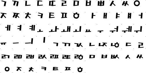
Here are the glyphs for the three sets of jamo:
| L | V | T |
|---|---|---|
| ᄀ ᄁ ᄂ ᄃ ᄄ ᄅ ᄆ ᄇ ᄈ ᄉ ᄊ ᄋ ᄌ ᄍ ᄎ ᄏ ᄐ ᄑ ᄒ | ᅡ ᅢ ᅣ ᅤ ᅥ ᅦ ᅧ ᅨ ᅩ ᅪ ᅫ ᅬ ᅭ ᅮ ᅯ ᅰ ᅱ ᅲ ᅳ ᅴ | ᆨ ᆩ ᆪ ᆫ ᆬ ᆭ ᆮ ᆯ ᆰ ᆱ ᆲ ᆳ ᆴ ᆵ ᆶ ᆷ ᆸ ᆹ ᆺ ᆻ ᆼ ᆽ ᆾ ᆿ ᇀ ᇁ ᇂ |
Notice that the L and T have square(-ish) outlines, while the V are horizontal, vertical, or both. There is also a lot of duplication between the L and T groups. Don’t worry about this; the way T are used, there is no ambiguity about which jamo is which. Also, notice that many of the V and T are diphthongs; they look like combinations of other jamo, but they are actually distinct characters (e.g. ᅪ ᅰ ᆪ ᆶ).
Here are the basic rules for laying out a Hangul character given its (L, V, T):
-
The V determines the core layout.
-
The L is placed adjacent to the V according to the core layout.
-
If present, the T is placed below the combined L and V.
Three core layouts are determined by the V for a particular Hangul
character. These are Horizontal, Vertical, and Both. We will call these
three layouts VH, VV, and VB. Here are their layout rules:
| V | RULE | Layout |
|---|---|---|
| ᅩᅭᅮᅲᅳ | VH | L is placed above V |
| ᅡᅢᅣᅤᅥᅦᅧᅨᅵ | VV | L is placed to the left of V |
| ᅪᅫᅬᅯᅰᅱᅴ | VB | L is placed above and to the left of V |
For example, suppose a particular Hangul character breaks down to an LVT
of (ᄆ,ᅵ,ᆯ). With ᅵ as our V, we have to use the VV rule, producing
미. Since T is present, we squish up the combined 미 and place the T
below it, producing 밀. This happens to be the second character from
our font samples above. Here are the breakdowns for some other
Hangul characters:
| Hangul | Lead | Vowel | RULE | Trail |
|---|---|---|---|---|
| 으 | ᄋ | ᅳ | VH | |
| 루 | ᄅ | ᅮ | VH | |
| 시 | ᄉ | ᅵ | VV | |
| 쳬 | ᄎ | ᅨ | VV | |
| 화 | ᄒ | ᅪ | VB | |
| 의 | ᄋ | ᅴ | VB |
| Hangul | Lead | Vowel | RULE | Trail |
|---|---|---|---|---|
| 은 | ᄋ | ᅳ | VH | ᆫ |
| 룰 | ᄅ | ᅮ | VH | ᄅ |
| 싫 | ᄉ | ᅵ | VV | ᆶ |
| 촁 | ᄎ | ᅨ | VV | ᄋ |
| 홧 | ᄒ | ᅪ | VB | ᆺ |
| 읨 | ᄋ | ᅴ | VB | ᆷ |
One Implementation
For the Korean version of Sly Cooper & The Thievius Raccoonus,
we originally chose HY Gothic as
our Hangul font. This is the Korean font used for most of this article. It is
proportional. We found that properly laying out HY Gothic involved a
dozen transformation rules (e.g. scaling and moving). The V jamo did not
have as much consistency in L placement as we had expected. For example,
the ᅳ and ᅮ glyphs, while both using the VH layout, have different
amounts of “open” space above them, because they have different heights.
Thus, there were many transformations for the various V jamo. Even with
all these transformation rules, we could not manage to get every single
LV combination looking good.
We eventually switched to a font we call “AsiaRythm1” (its actual name is Asia리듬제). This font is non-proportional and it was much easier to implement. In most cases, the jamo glyphs do not need any transformation before being combined. Below is a bitmap we created from the font. Notice that dots mark the square surrounding each glyph. The jamo glyphs are justified within their squares so that they can be drawn by over-striking.
The glyphs for individual jamo are actually not available in the TTF file for AsiaRythm1. To create this font bitmap, we had to type Hangul glyphs into Photoshop, and then separate the glyphs into individual jamo. Once all the jamo glyphs were created, drawing a Hangul character was a simple matter of over-striking the appropriate jamo glyphs. For example, to draw the Hangul character 각, you would combine glyphs like so:
 +
+  +
+  →
→ 
An Exception
This over-striking method works in almost every case, with one
exception. When a V jamo from AsiaRythm1 uses the VH layout rule, that
character’s T jamo cannot be drawn with over-striking. These
horizontal V require that the T be moved beneath the V to make the
entire glyph appear as a vertical column. For example, you cannot draw
극 like this:
+  + →
+ →  WRONG!
The correct glyph is actually:
+ +  →
→  CORRECT!
This means you need to transform the position (and size, it turns out)
of the T jamo when combining with a VH jamo. The transformation might
not be the same for every T. Luckily, AsiaRythm1 needs just two
different transformations: one for thin T jamo (glyphs like ᆨ and
ᆼ), and one for thick T jamo (glyphs like ᆩ and ᆱ).
Again, composition rules for Hangul glyphs depend on the underlying font. AsiaRythm1 is simple to dynamically compose because the font was designed that way. Once you have chosen the Hangul font you will be using, you will need to determine its composition rules by observation and experimentation.
Author’s Note
This piece was written on January 8th, 2003, for internal use by Sucker Punch Productions and other studios in the PlayStation family. For publication in 2025, it has been updated to refer to the latest Unicode standard and other updated sources. It has also been lightly edited for clarity.